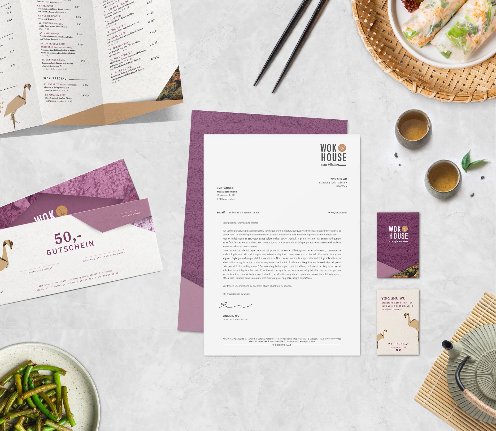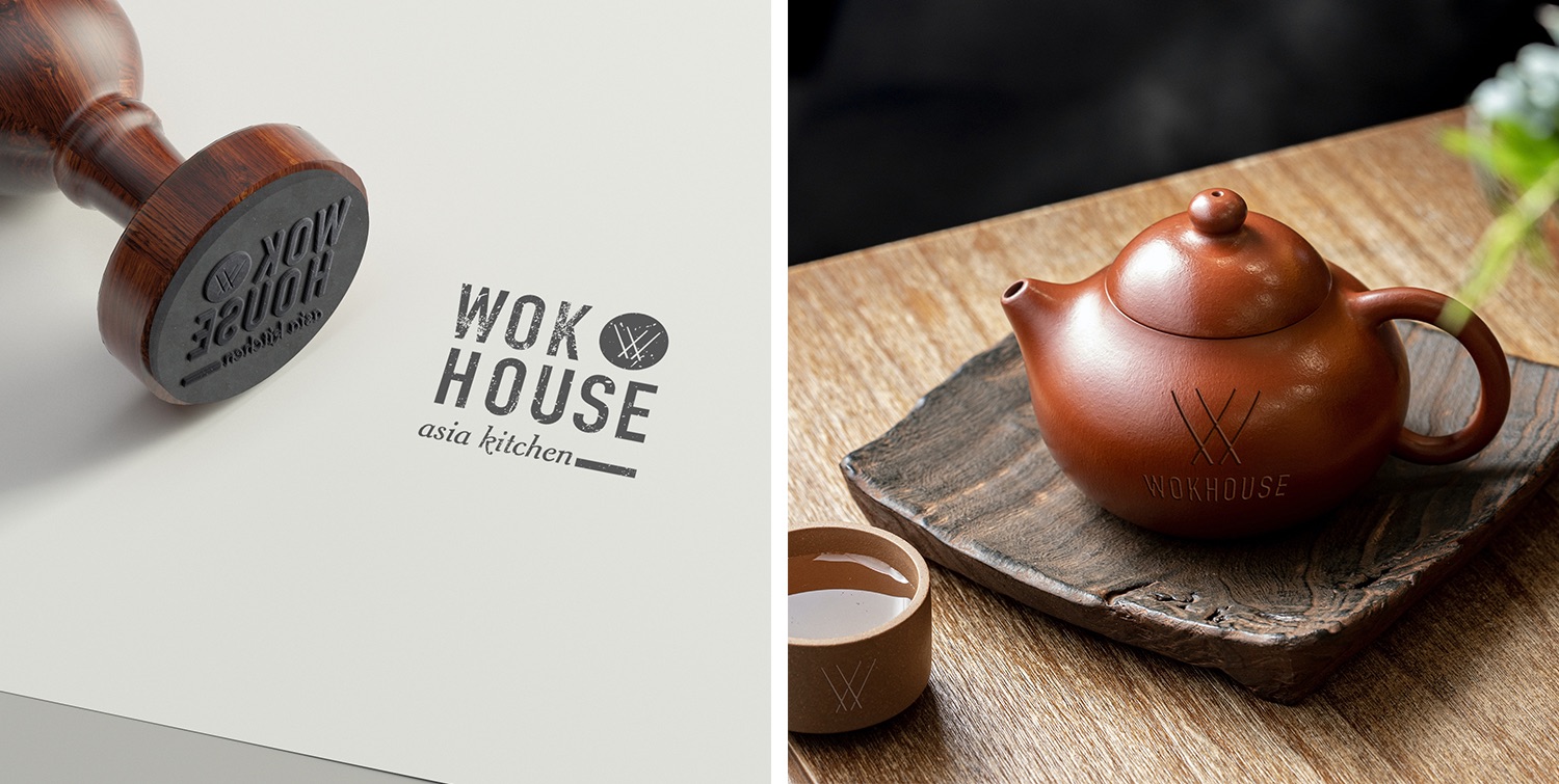

Customer: Wok House
Location: Erzherzog-Karl-Straße 169, 1220 Wien
Year: 2022
Website: wokhouse.at
Category: Brand Design
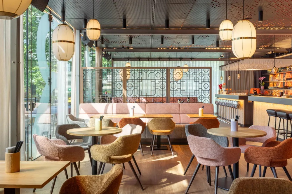
The wok house in Vienna’s 22nd district has been impressing visitors for years with its extensive Asian buffet offer. After being commissioned to give the interior spaces a new look in 2016, the corporate identity now also received a fundamental overhaul.
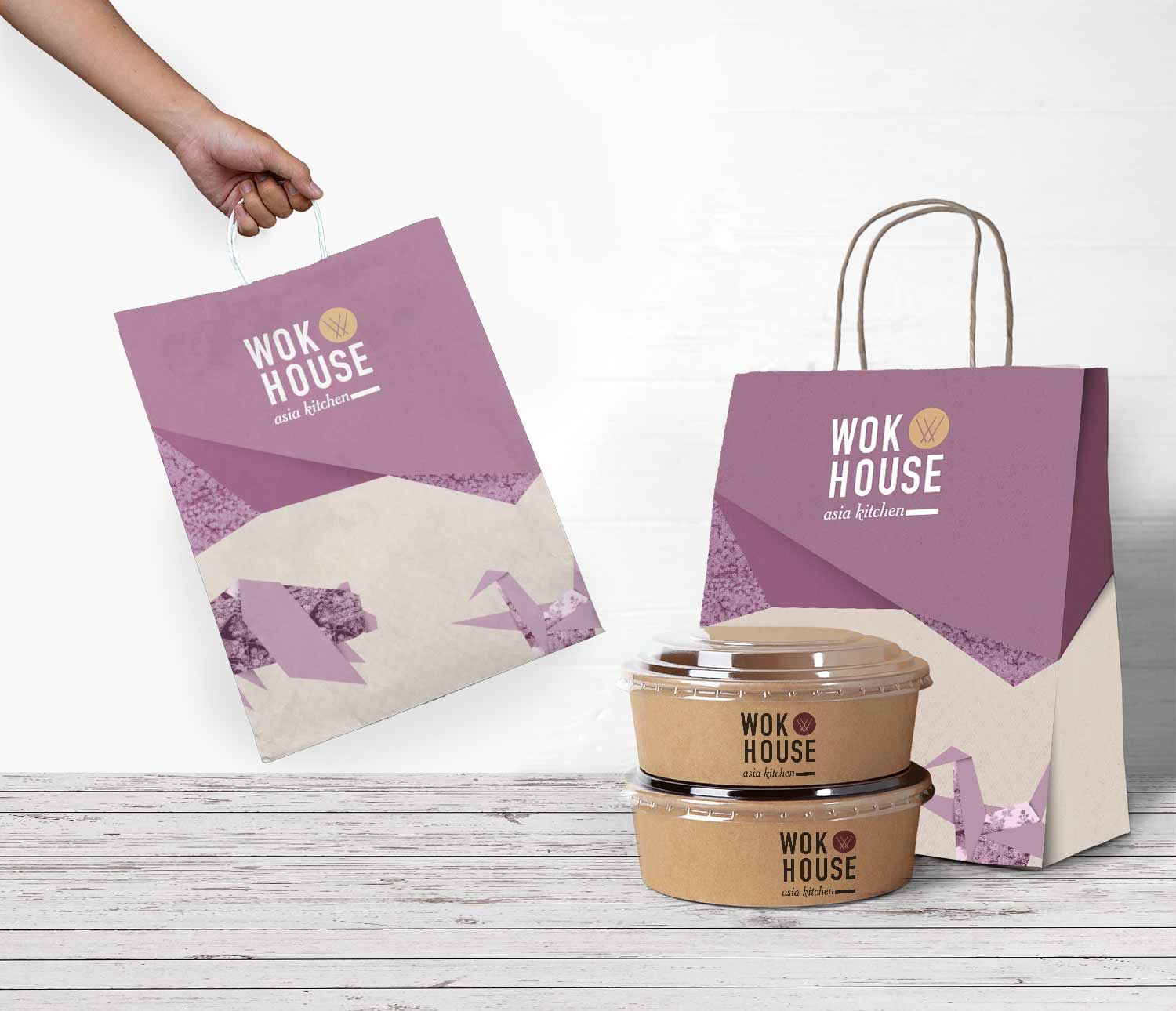
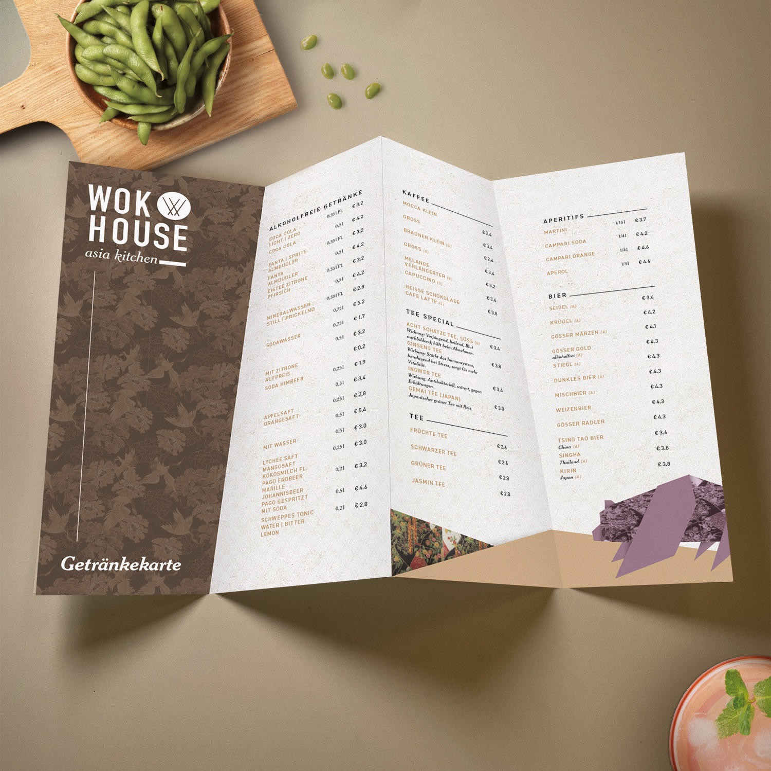
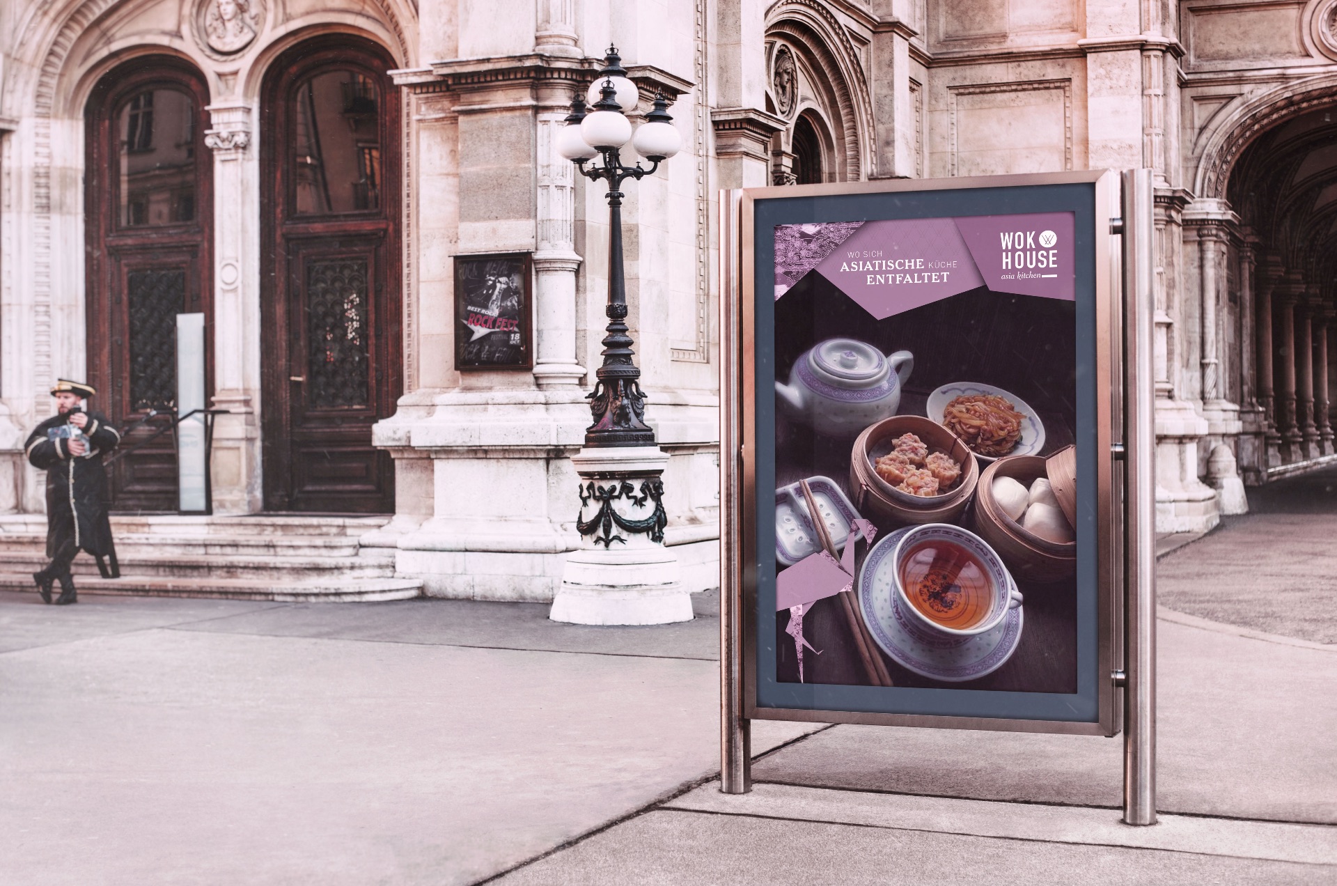
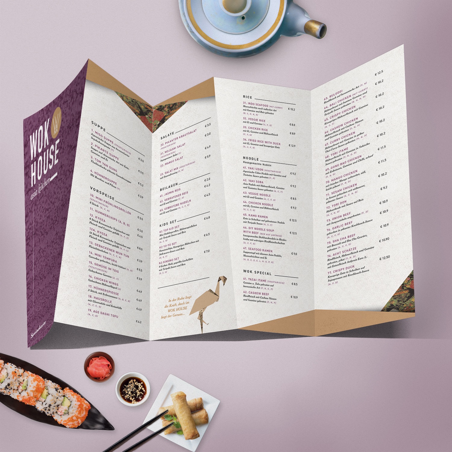
The theme of origami already played a role in the decoration of the interior, and was now also integrated as an important design element in the CI design. Under the slogan “where Asian cuisine unfolds”, reference is thus also made to the origami theme in the language, which is visually accentuated by geometric elements. Characterized by the primary color of “plum” – which was adopted from the existing interior design and is accompanied by the secondary colors of beige, gold, medicinal clay and foggy gray, creating a modern and harmonious color palette. The result is a lively but soft design language that offers plenty of space for and complements the main protagonist – the food.