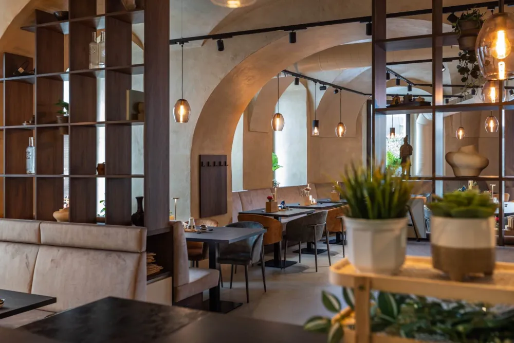

Client: Saigon Restaurant
Location: Wien
Year: 2021
Website: saigon.at
Category: Brand Design
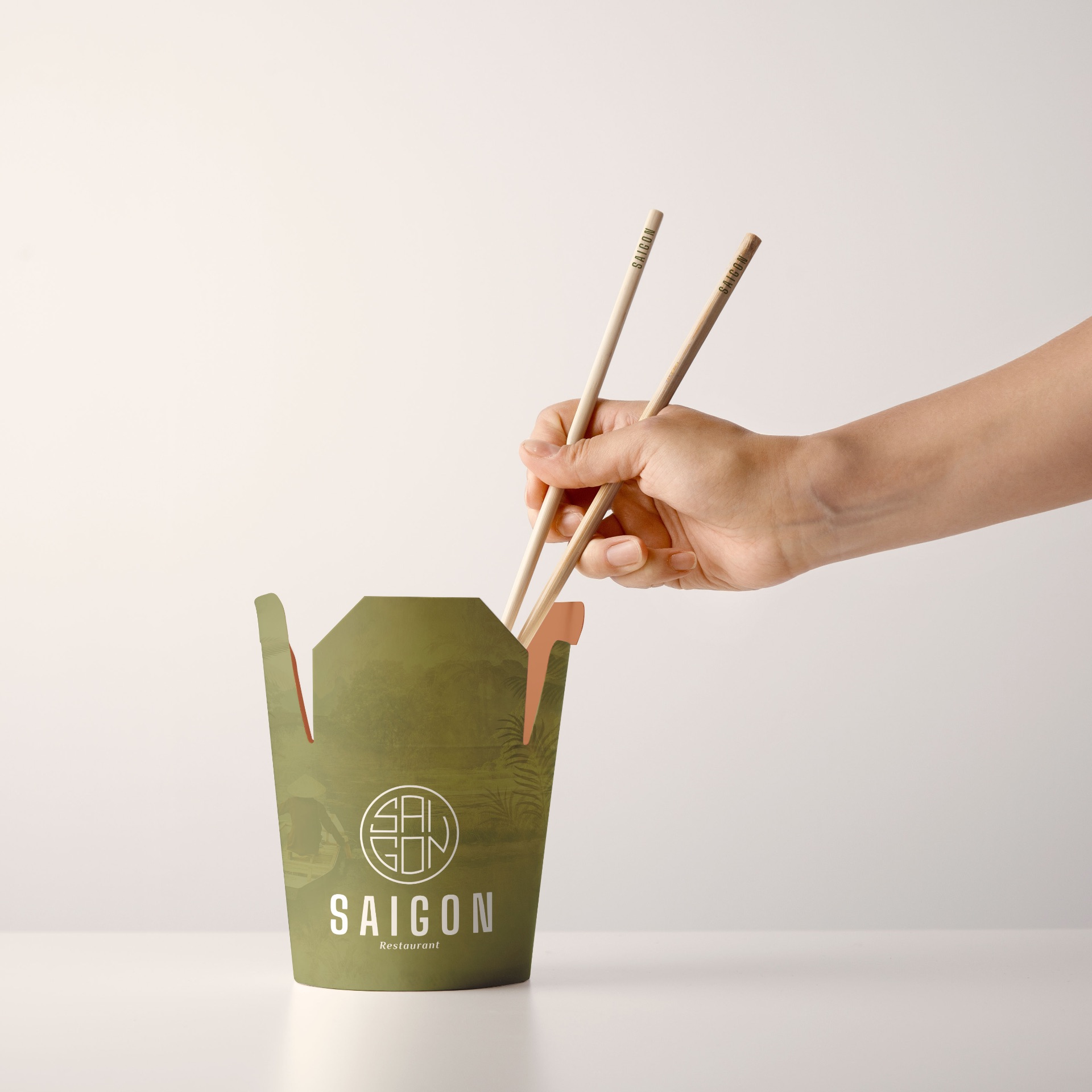
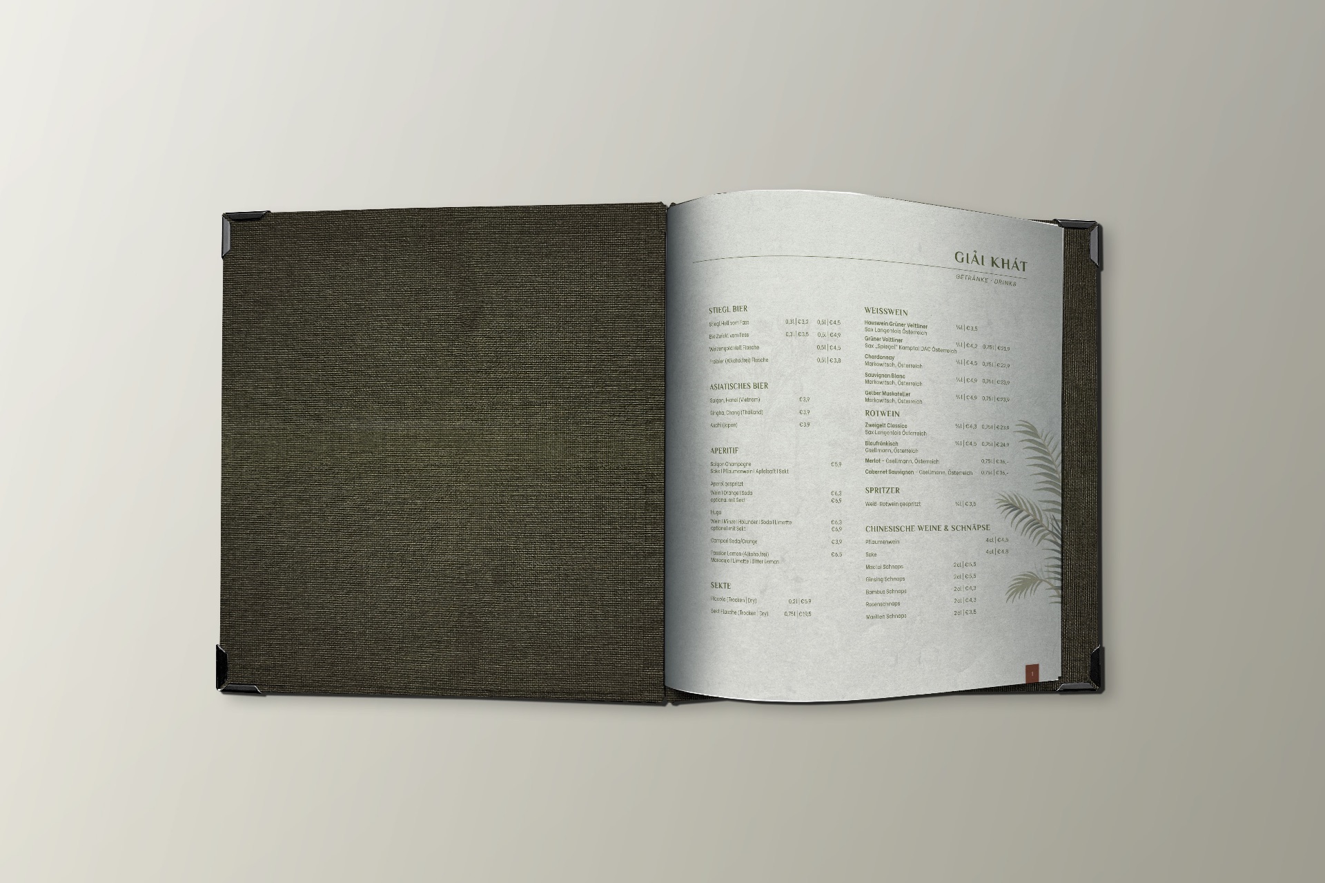
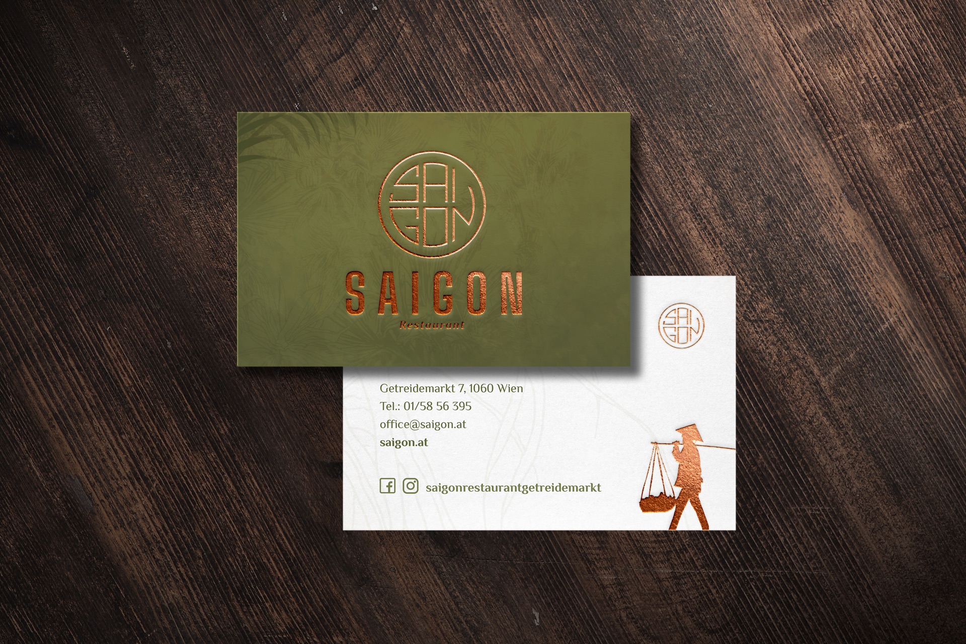
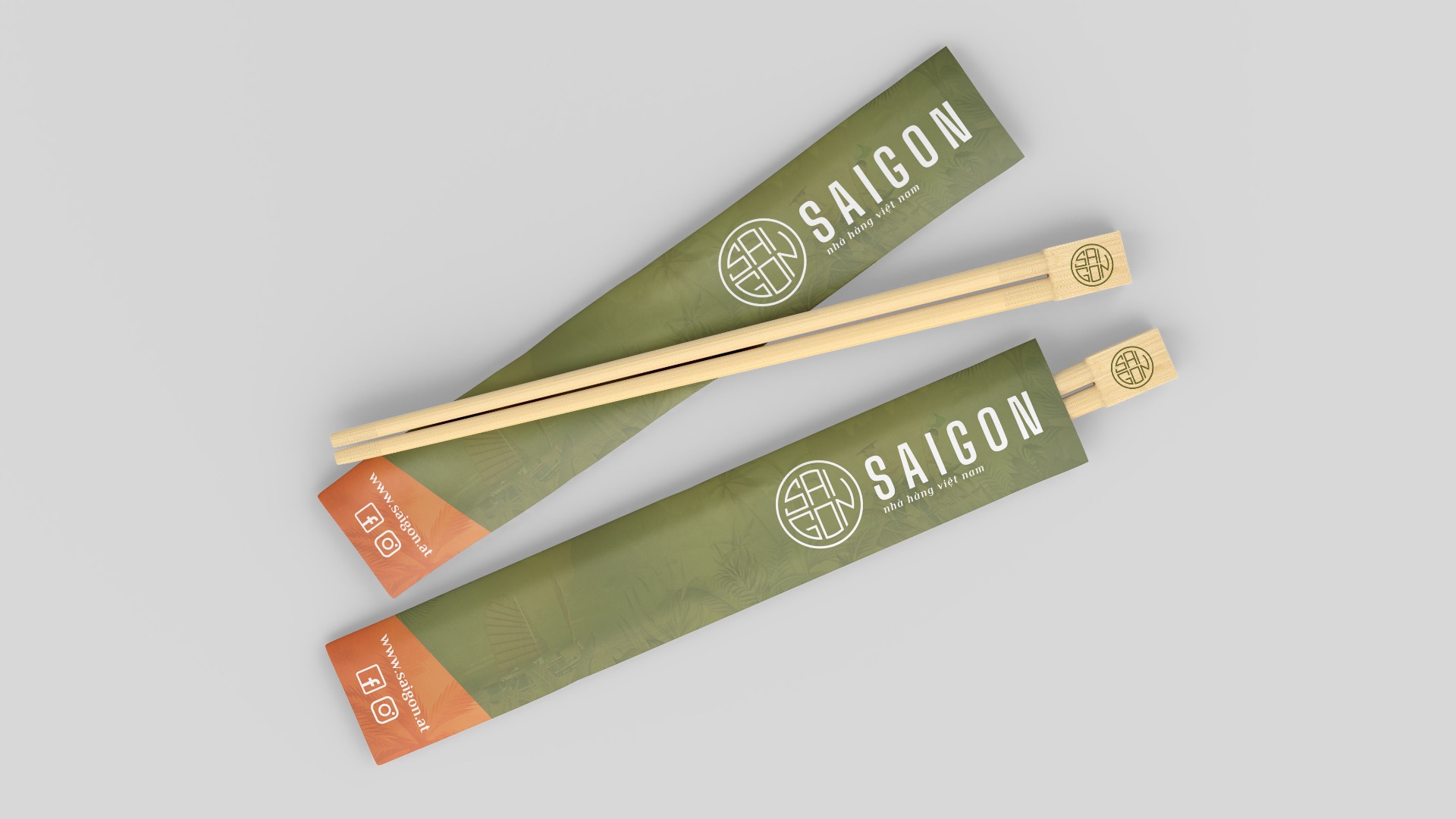
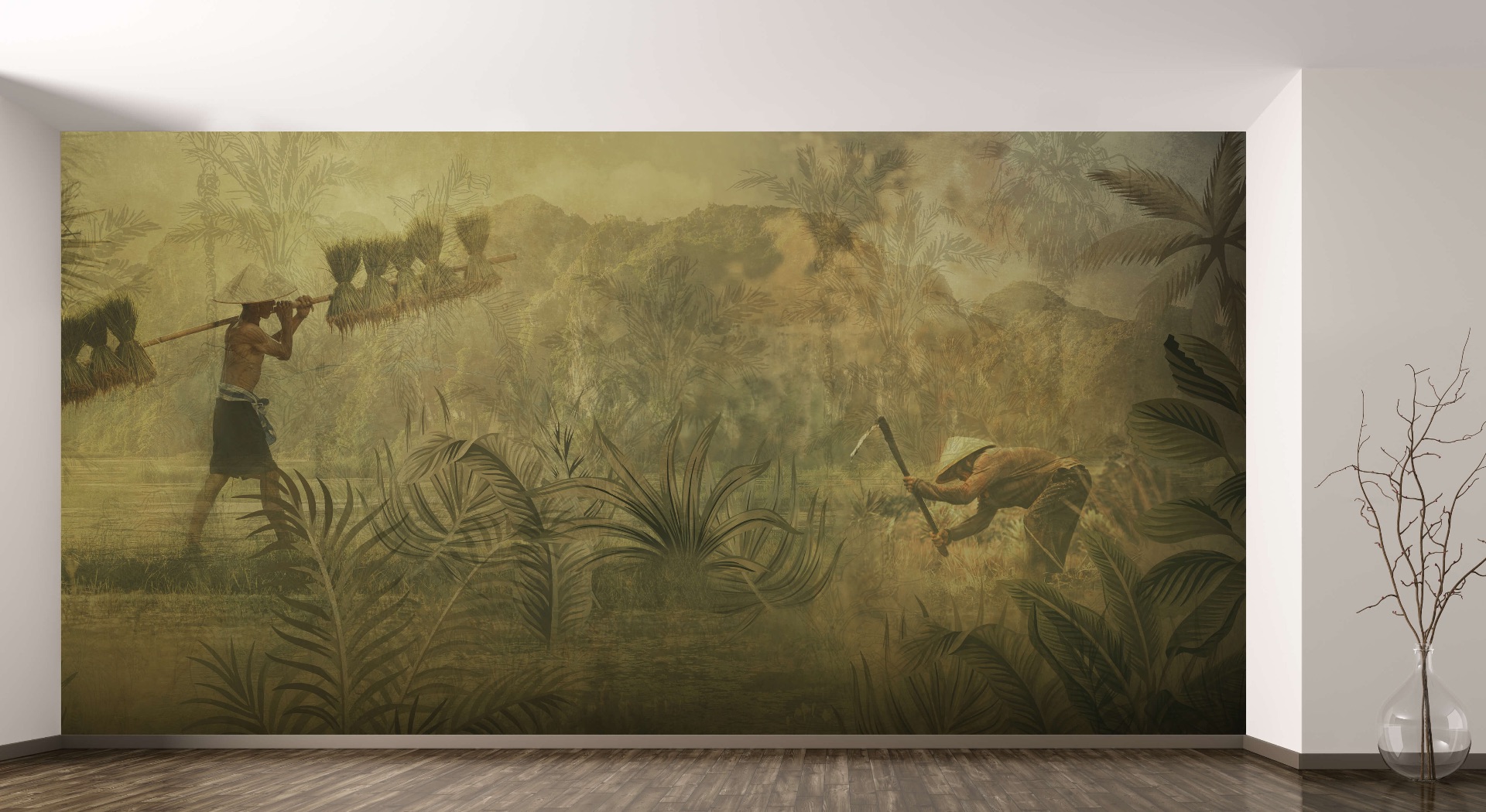
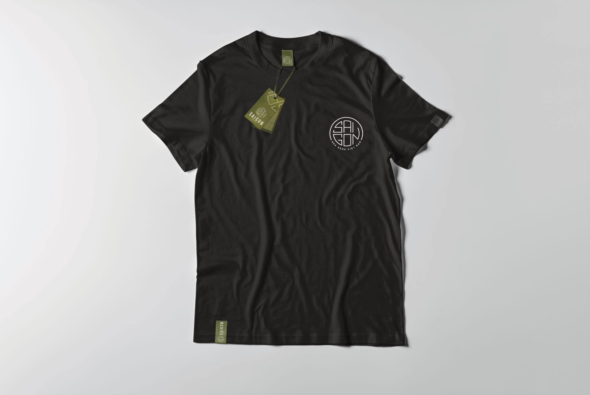
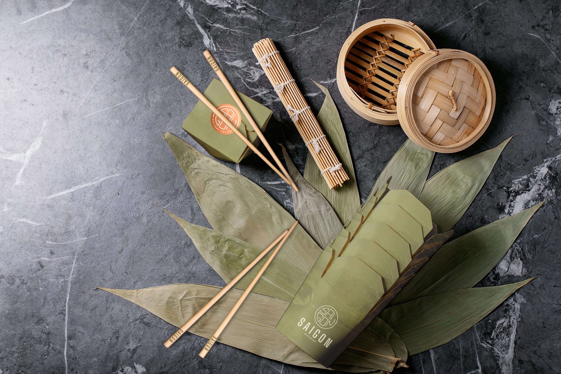
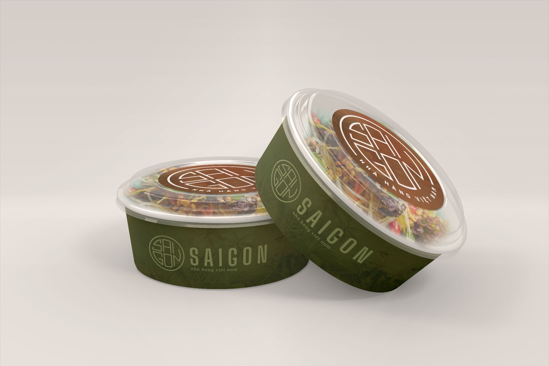
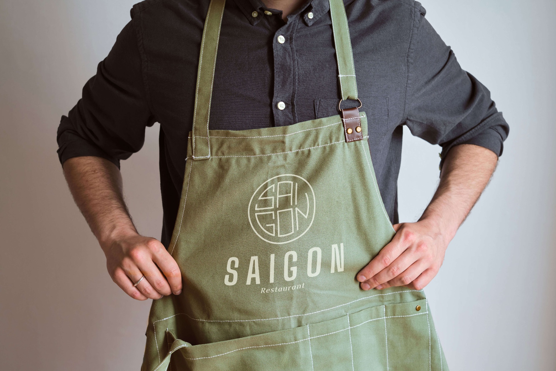
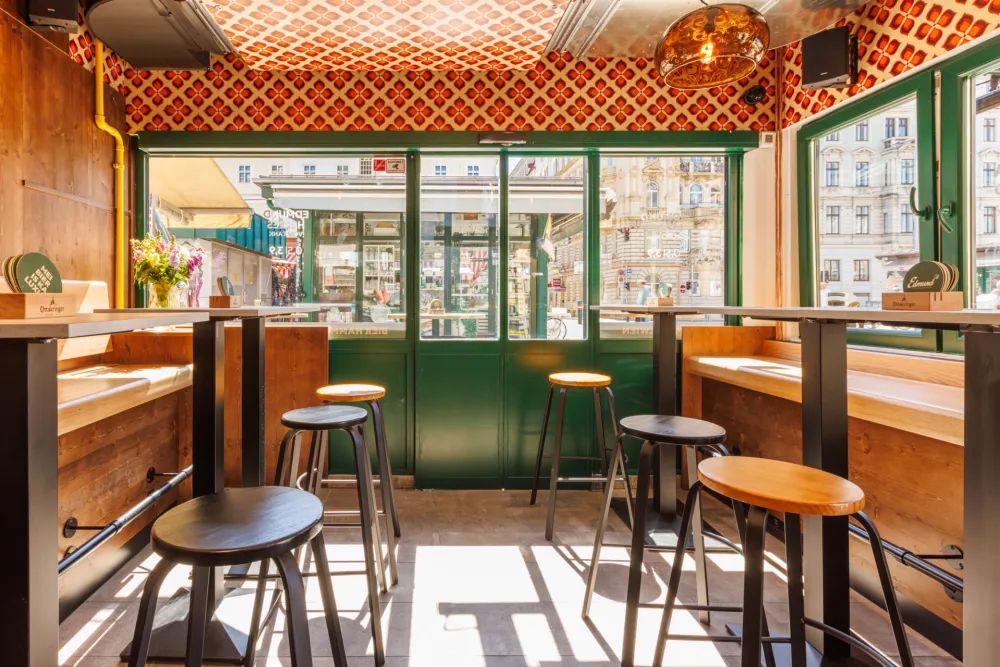
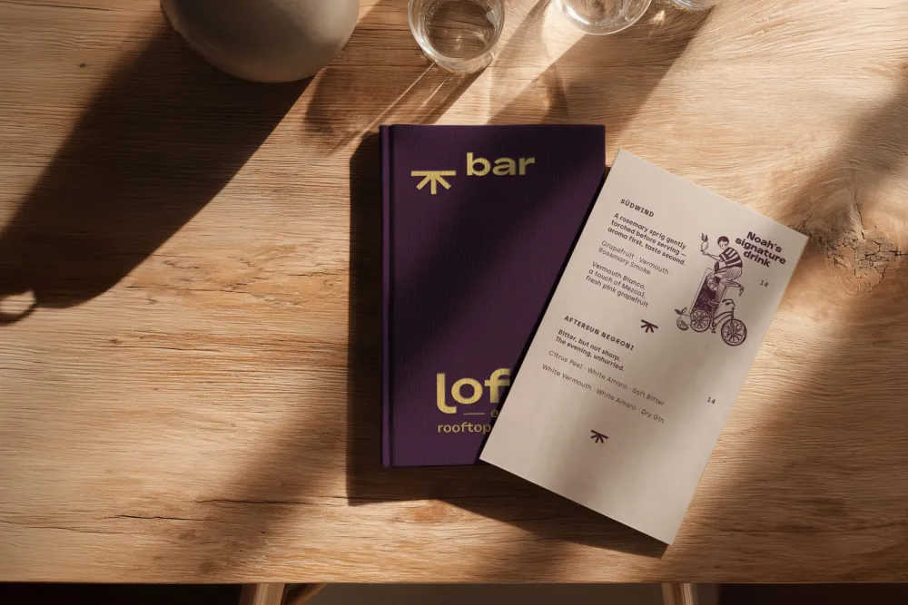
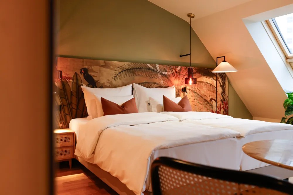
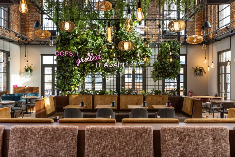
Alongside the renovation of the restaurant at Getreidemarkt, Derenko developed a new corporate design for "Saigon." The new word-and-image mark combines modern typography with a geometric emblem to create a timeless logo. Inspired by the flora and fauna of Vietnam, the color palette of green, yellow, and orange tones reflects the country's vibrant nature. Photorealistic motifs and artistic illustrations on wallpapers and print media create a cohesive image that emphasizes the authenticity of Vietnamese culture. With this holistic CI redesign, Derenko seamlessly merges brand management and interior design into an emotional unit.